Design System
PenFed Credit Union
Role
UX/UI Designer, Design System cohort

Background
PenFed’s UX team did not have a proper design system; it was a component library that had become outdated. This library lacked the essential foundations of a design system, such as typography, page standards, padding, grids, etc.
The listed components also had confusing naming conventions and was built for functional components only, not base.
Goal
Create a design system built in Figma.
Provide basic foundations that represents the PenFed online brand and new redesign.
Rebuild the components based on atomic design, so there are both base and functional components.
Build mobile responsive components for mobile first approach.
Design System Foundation
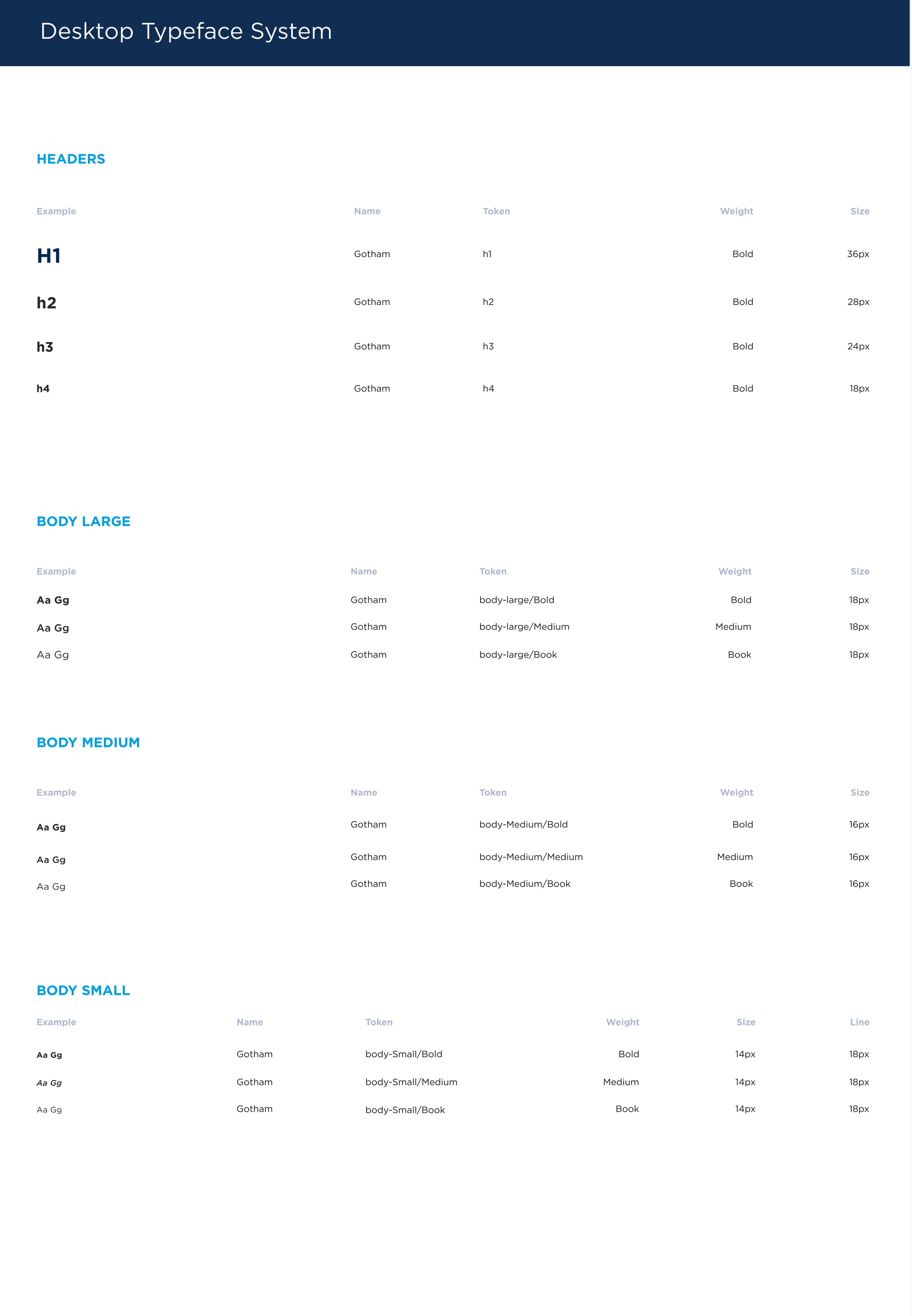
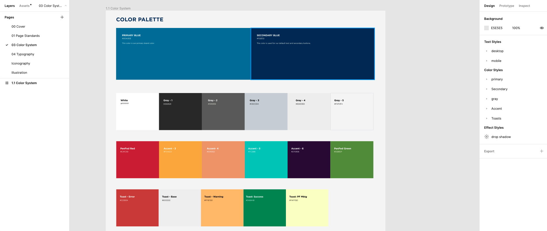
Design system foundations was lacking from the previous library, we needed to dedicate time to add our color systems, brand logos, iconography, typography, grid systems, and spacing scales.
Components
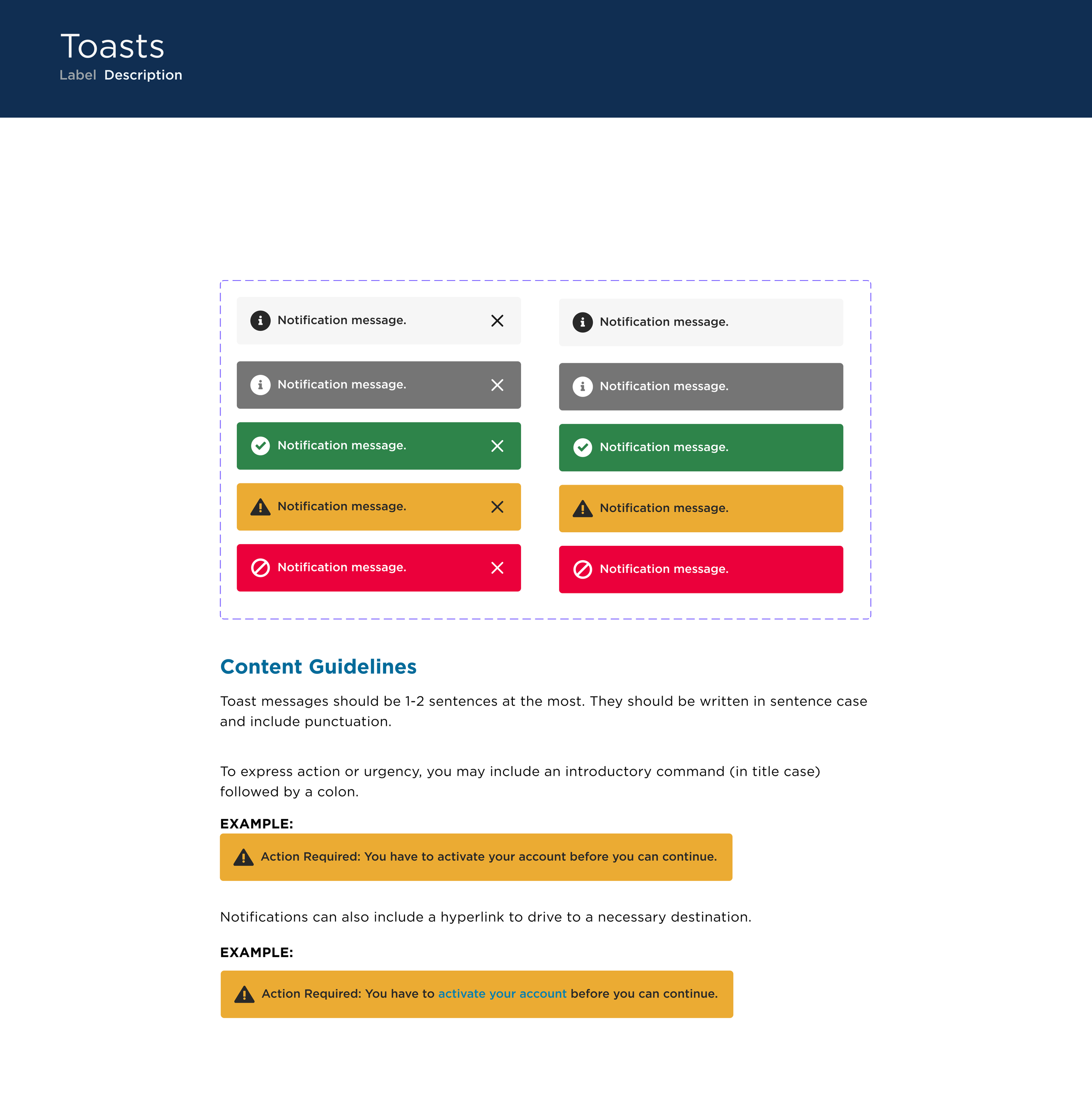
Base Components
Our first step was to review our new redesign projects and break down the page into base components so we could catalog them since they were lacking in the previous library.

Functional Components
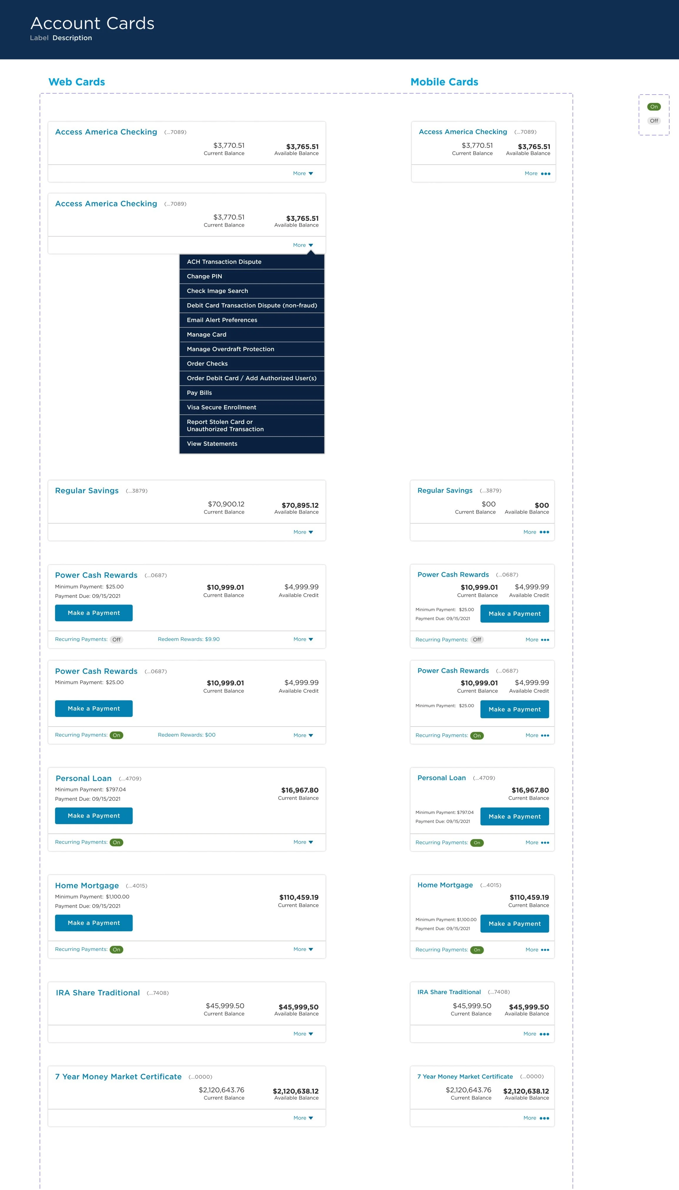
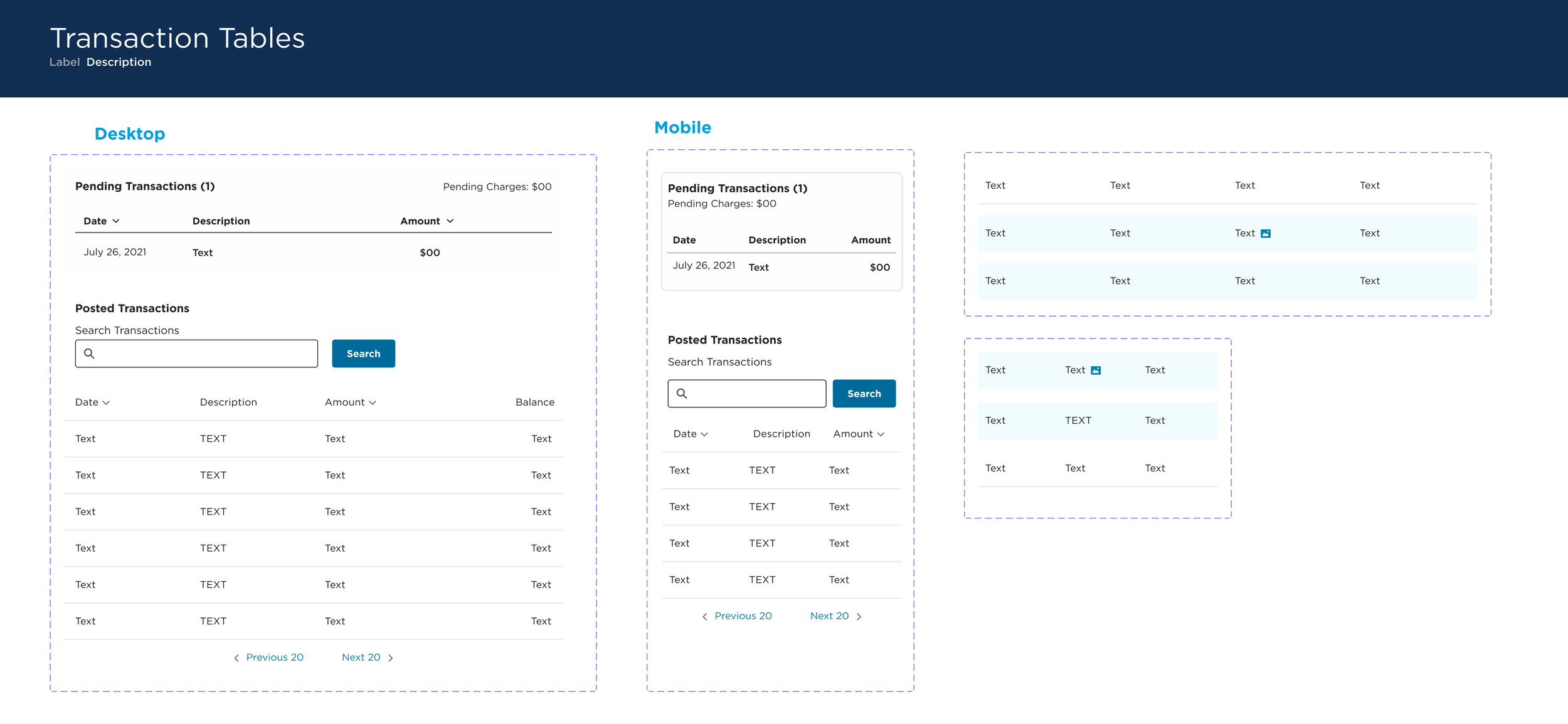
Then we looked at our functional components like the account cards on the account summary or transaction table from the account details page that we recently designed.
Making these functional components will encourage reusability and reduce technical debt.
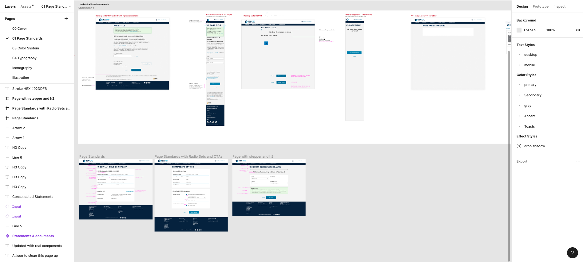
Patterns and Page Standards
The redesign meant learning a new design language for the greater UX team and the dev teams.
By establishing our new patterns and page standards, we can quickly adapt to the new language and bring it to life in our projects while keeping a cohesive UI and experience.
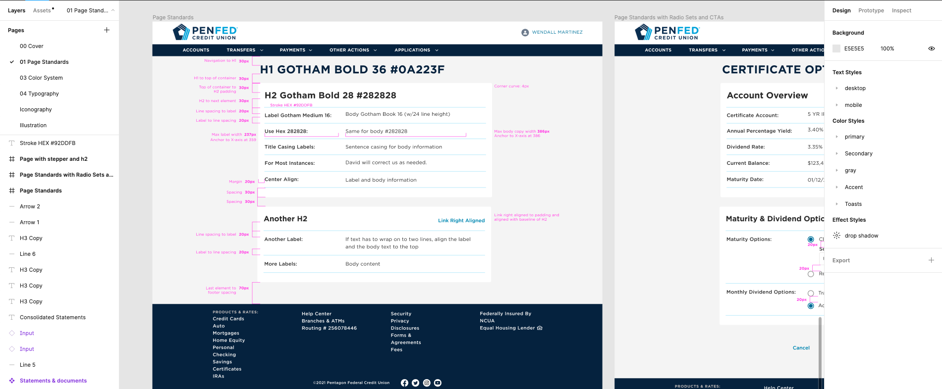
The design system cohort built examples for pages in every stage of a flow or stand-alone screens.
We broke down the padding for each page and then provided an example of what this padding would look like without annotation.
Accessibility
PenFed members are largely retired veterans, so accessibility is vital to our design and member experience. We ensure that all of our colors have the correct contrast ratios or provide alternative colors for different backgrounds to meet WCAG compliance.
We also check to ensure our components are friendly for accessibility tools.
Next Steps
We are educating and promoting the design system within our team, but collaboration between our dev teams is so important.
We plan to host workshop sessions with our dev teams to showcase the design team to get input on the components we’ve implemented so far and will continue to involve them as the design system grows.