Vela
Case Study
Role
UX/UI Designer, Research
The Problem
Water sports athletes need a way to quickly check weather conditions in their desired location to make decisions that will keep them comfortable and safe while enjoying their favorite activity.
Currently, these athletes use multiple apps or sources of information to access the information needed specifically for sports out on the water. Once forecasts are located, users have to decipher through complex weather charts which can leave even the most advanced water sports enthusiast perplexed.
Vela’s Solution
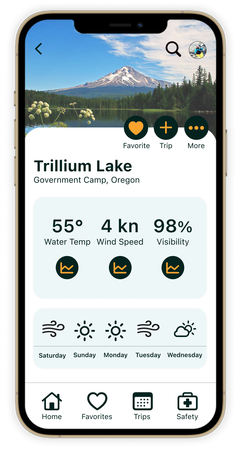
Weather condition display that shows relevant data and can change depending on the chosen sport in a text format.
Visually appealing graphics that reflect weather so users can easily read conditions.
User flow is intuitive and makes for accessing weather quickly, so less time is spent searching.
The ability for users to select their sport so information is customized. Users will also have the ability to change the sport at any time.
The ability to plan for the weather in advance for future trips.
Safety tips and precautions page that can be accessed in offline mode if necessary.
Competitor Audit
Although Vela did not have direct competitors on the market, I still wanted identify the strengths and gaps of the apps that target users were already using. Two strong competitors had elements that I wanted to improve for potential users, while also bringing to light some weakness to be mindful of in the Vela app. .
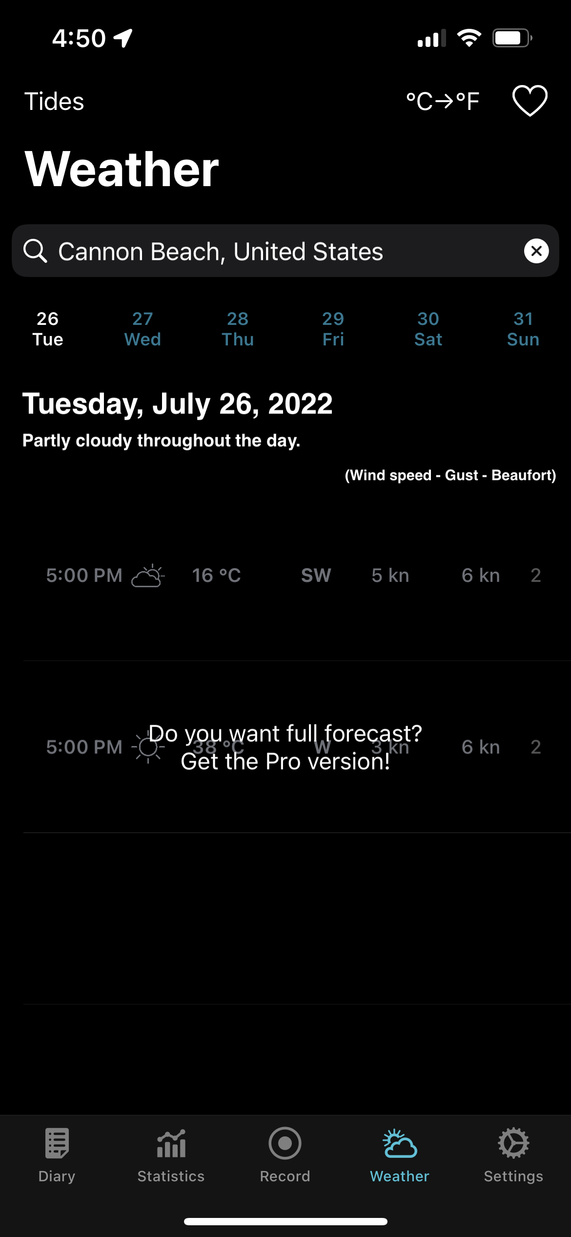
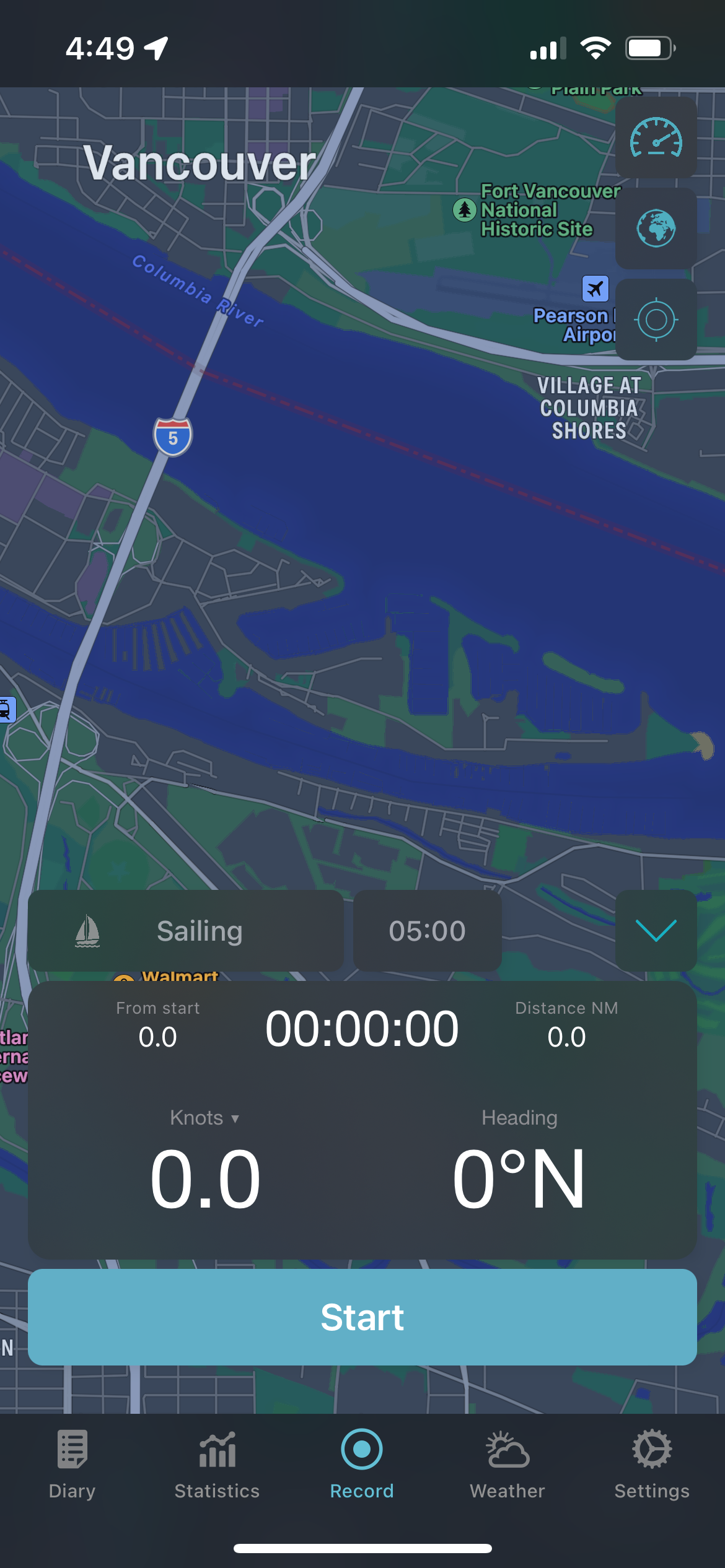
Waterspeed
An app specifically used for water and wind athletes.
It's mainly used as a performance tracker but offers weather features.
Users can select their sport of choice and will show relevant info for that sport.
The only app that provides both sports performance and weather conditions.
The user cannot change the location, so they cannot check the weather beforehand.
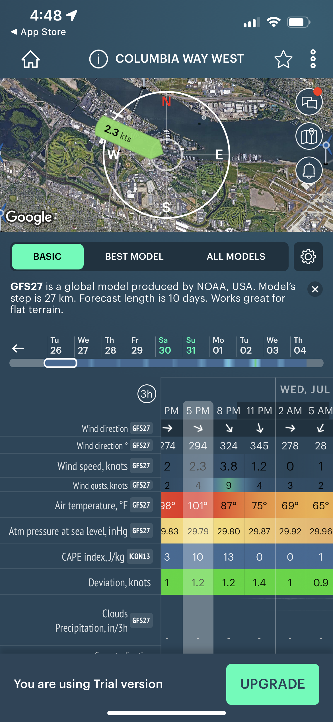
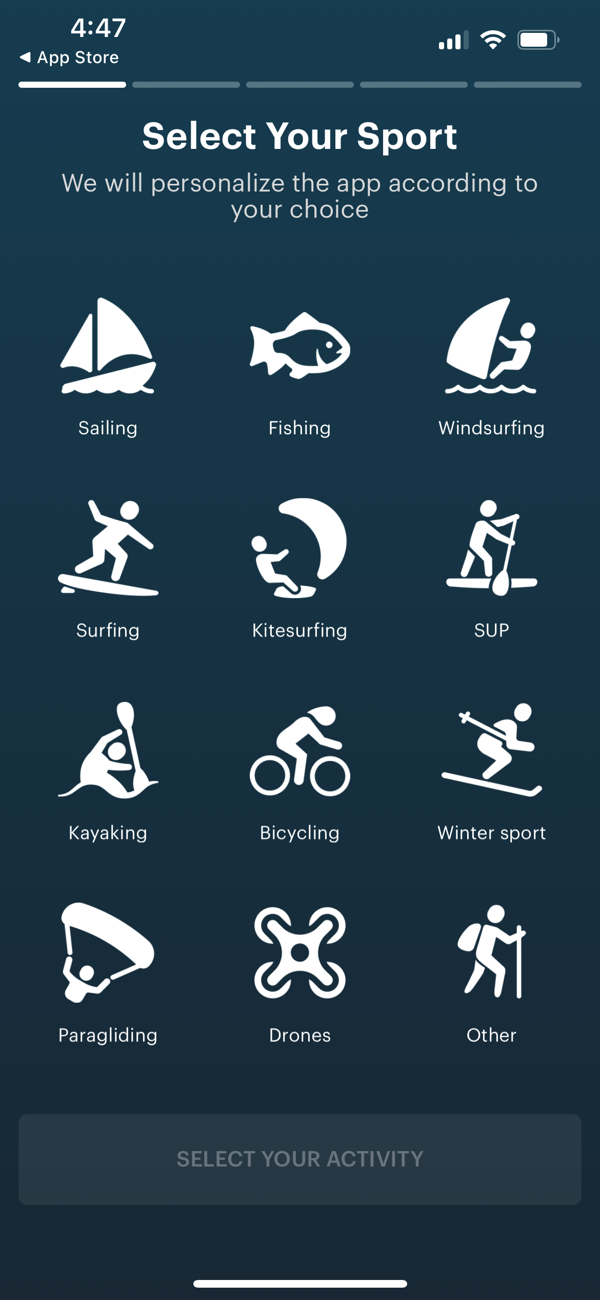
Windy.app
Provides water sports athletes and enthusiasts with credible weather information in real-time.
Users can check the weather a week in advance or before heading out on the water.
Alerts can be set to notify users of bad conditions for trips.
Users can still access map data in offline mode.
Pages are overwhelming to look at and comprehend.
Cannot be used as a quick reference because it takes too long to go through charts.
Defining the User
User Interviews
In order to understand the needs of future users, I selected a range of water sports enthusiasts to interview to see how they interpret weather conditions and understand their general recreational sports routine.
Interview questions were prepared before the sessions and each session took 15-20 minutes.
I identified 3 potential users: an avid surfer, a causal kayaker, and a potential user that was active in kayaking, white water rafting, and boat fishing.
These interviewees provided a broad sense of potential user behaviors and routines around water activities. I learned about each participant’s routine and behavior around their water activity. All of this information was then organized into an affinity map and used as a basis to develop personas.
Personas & User Journeys
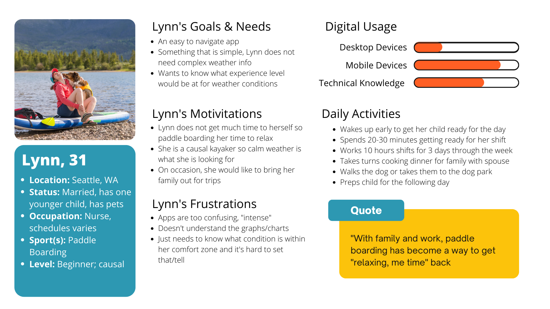
Personas and user journeys could be defined to meet expectations and to empathize with potential users with the themes identified from user interviews and affinity map. Two primary personas were developed to cover the range of target users: Sean and Lynn.
Sean captures the experienced athlete who requires more personalized functionality.
Lynn represents the causal water sports enthusiast who needs to know basic weather information and might rely on the safety features.
Navigation
Card Sort Testing
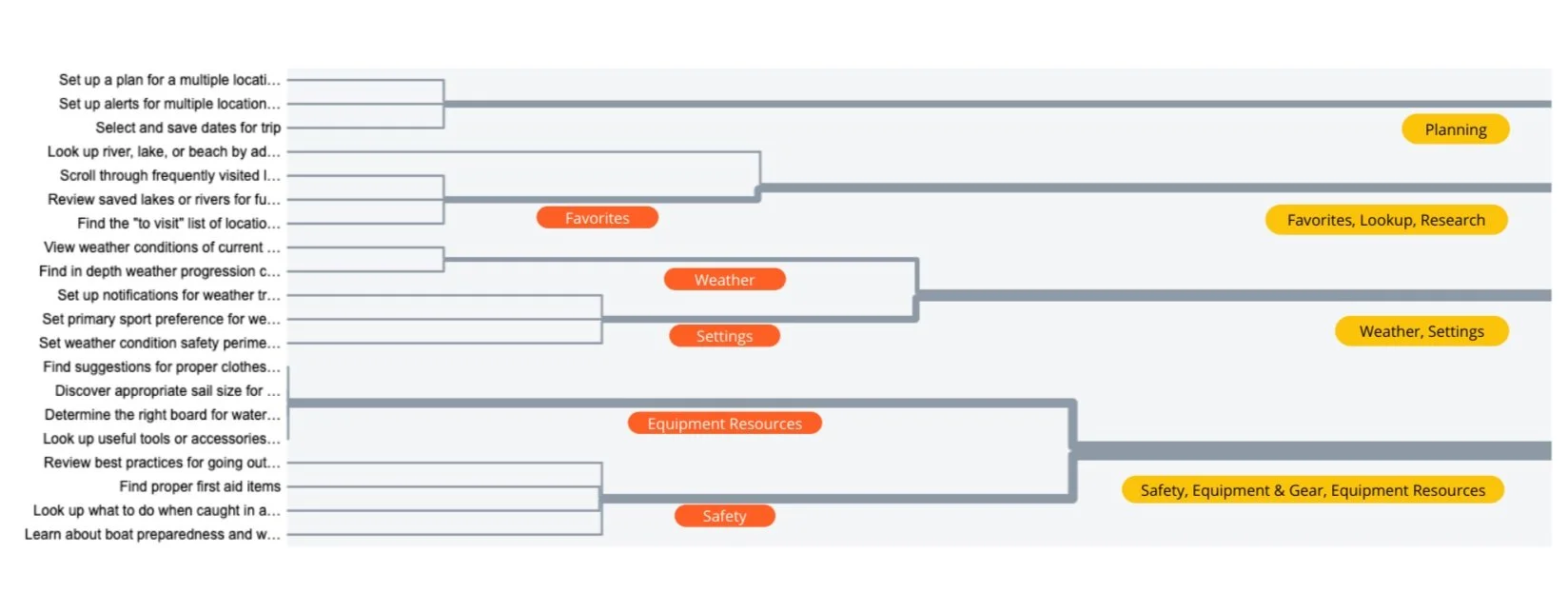
I conducted an open card sort test to establish a navigation structure and site map to ensure intuitive navigation for Vela users. The open card sort had 8 participants, which allowed me to understand how potential categorize the functionalities of Vela. The participants were given a series of actions that could be taken within the Vela platform, then they assigned a label for that action.
Below is the similarity matrix as a result of the card sort.
Site Map
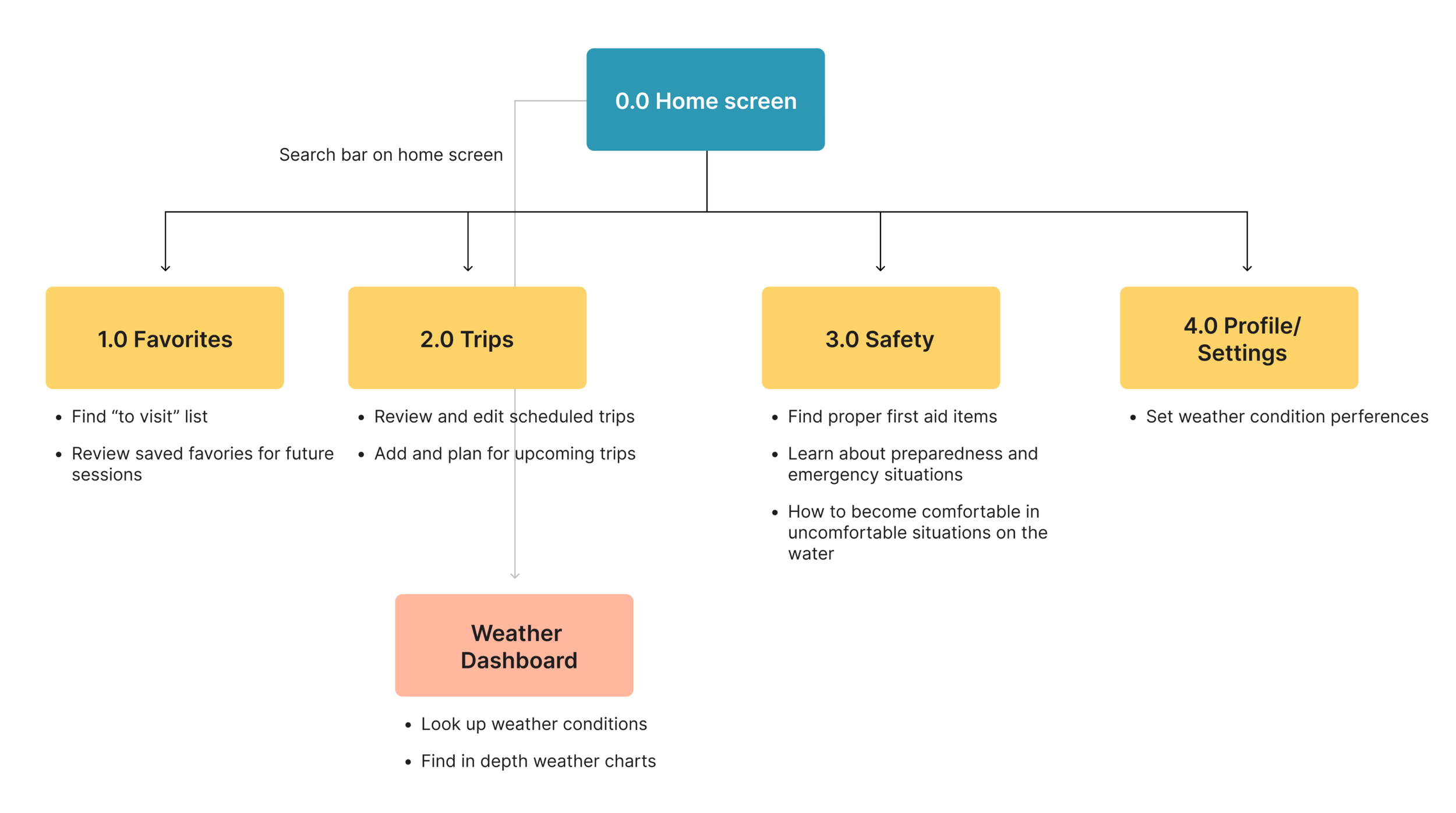
Based on the results, the main navigation will be based on the four categories identified on the card sort: planning, favoriting and search, settings, then safety and gear.
Now that I understood how potential members grouped the functionalities, I could formulate the site map and navigation.
Lofi Wireframes
Once the navigation was established, I started lofi wireframes of the Vela app, focusing on the functionality of the major features: the weather dashboard and planning a trip.
Weather Dashboard
The weather display and dashboard needed to be clean but still convey pertinent information in order for users to prepare for their water sports activity and gauge their safety comfort level.
The dashboard provides this information in simple text so even the most beginner enthusiast understand the weather conditions but the buttons underneath link to traditional weather charts for the advanced athlete.
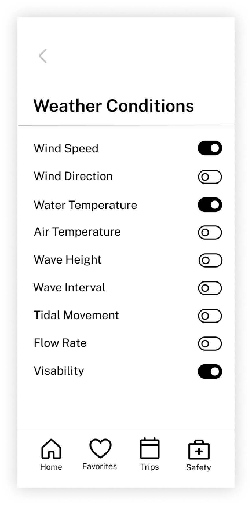
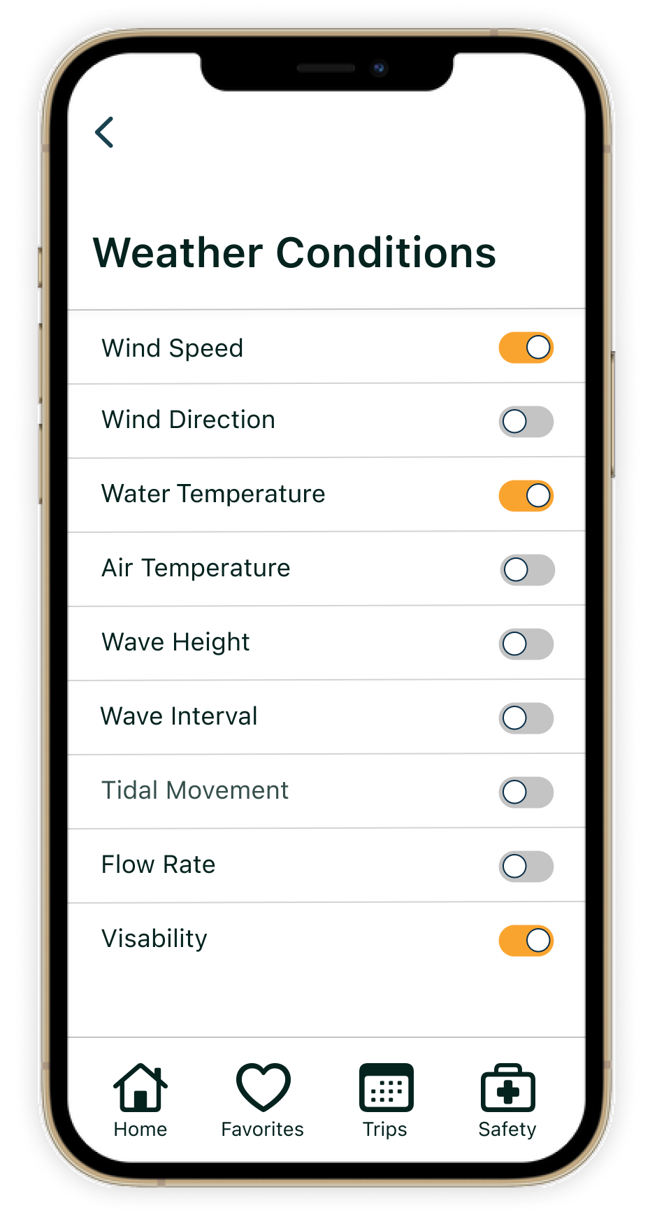
The user also has the ability to customize their display to view the weather conditions most valuable to their sporting needs in the settings.
Planning a Trip
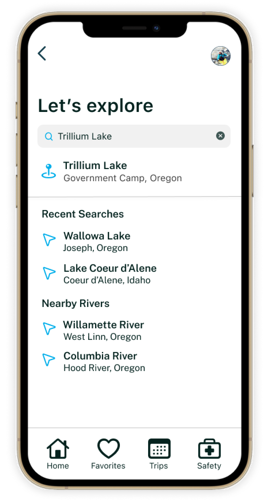
Planning in advance and monitoring weather for trips was an important feature that was lacking in the current market. I had to make sure that this functionality was available to users within the navigation bar and when searching for locations.
The trips button takes users to an overview of upcoming trips they’ve already scheduled. They can tap through the planned trips to review weather conditions or edit the trip details.
The users can also add more trips by tapping the plus button next to the page header.
Usability Testing
User testing was conducted to assess Vela’s usability in navigating the mobile app for new users. Success was measured by the length of time it took to understand the navigation and features of Vela, in addition to the error rate in essential functions, such as searching and favoriting locations. I also observed the users' perception of the app's value and current usefulness.
-
6 participants
Age Range: mid 20s - 40s
Experience Level: Aspiring beginner to advanced athlete
Test Duration: 30-45 mins
Test Plan: The prototype link was sent to participants via text 5 minutes before scheduled session. Participants were asked for first impressions, then walked through scenarios to measure usability
All participants were able to move throughout the test with ease and found the prototype straightforward. Overall, the participants came across one high severity error and three medium to low severity issues that needed to be addressed.
Results
Based on the results of the user testing, I made the following changes to the design:
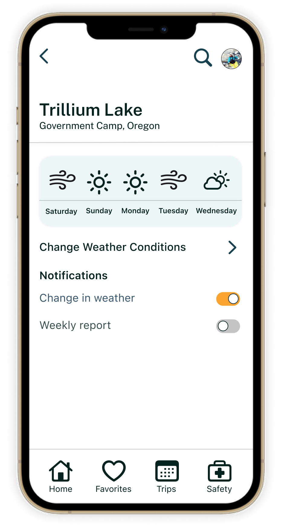
Removed the weather conditions from planning a trip and added an entry point to weather preferences settings from the weather dashboard - participants indicated that managing specific conditions on trips wasn’t necessary but wished that they could view and edit those preferences from their profile and on the weather display.
Improved date picker functionality - participants commented that they much rather have the ability to select and drag across multiple days on the calendar instead of picking a range of dates
Launch weather dashboards from forecast previews - participants were expecting to click on dates in the forecast preview chart to view more information on upcoming days.
Final Design
With the improvements made from the user test, Vela was ready to be moved over to the final hifi design and prototype.
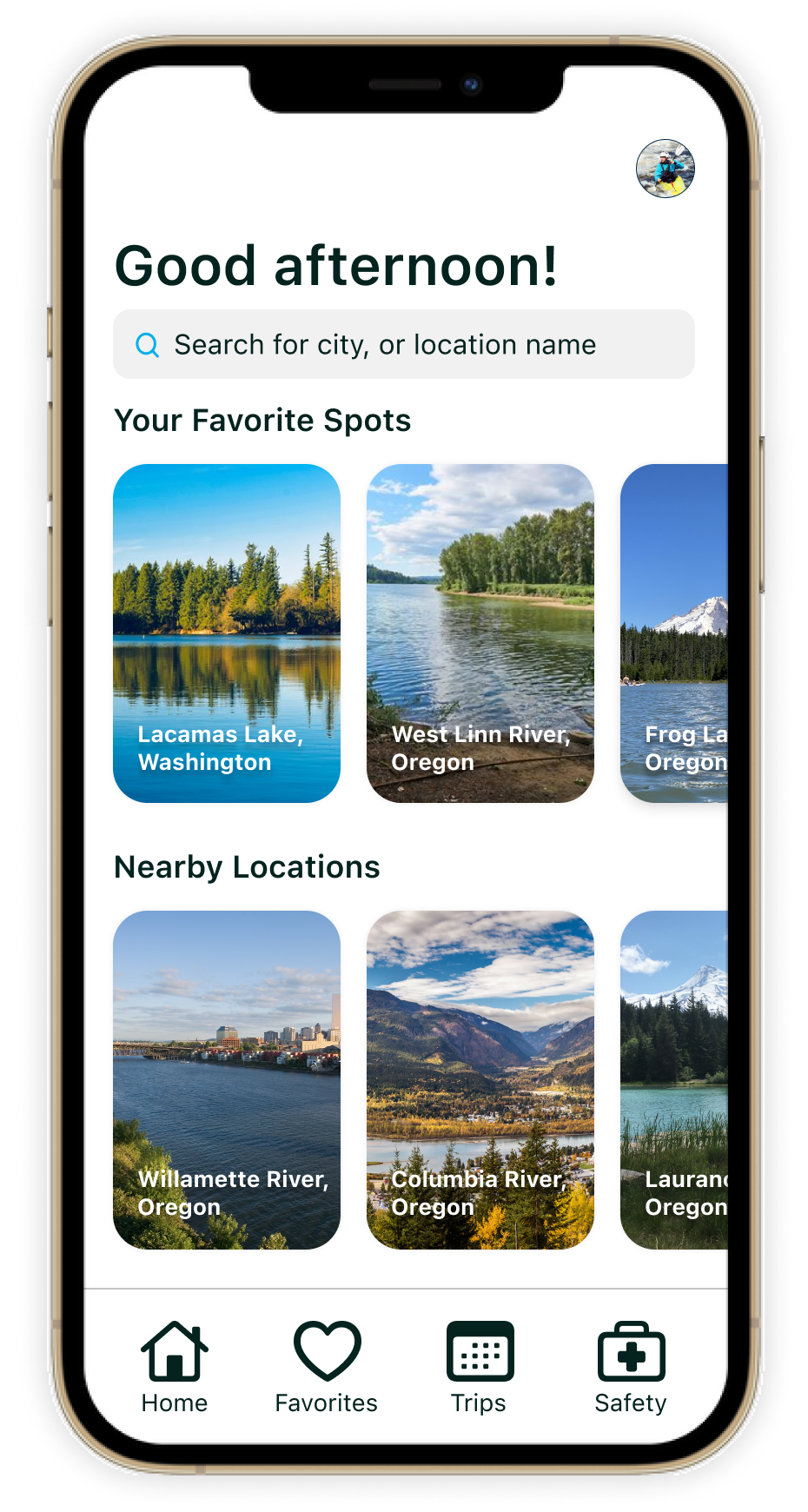
For the UI styling, I wanted a clean and sleek design because Vela’s purpose was to not complicate the weather.
The UI is very minimal to prevent overwhelming the user, increase findability, and reduce the amount of time the user spends on the app.
I used primary colors that are very natural and resembled bodies of water. For secondary or action colors, I picked colors commonly used with water sports equipment like kayaks or paddle boards.
I choose iconography that was playful and simply conveyed weather conditions.
The decision to have a conversational and upbeat tone was to encourage the causal enthusiasts or beginner athletes while still keeping the content straightforward for the experts.

