Personal Bank Account Transferring
PenFed Credit Union
Role
UX Design Lead
Background
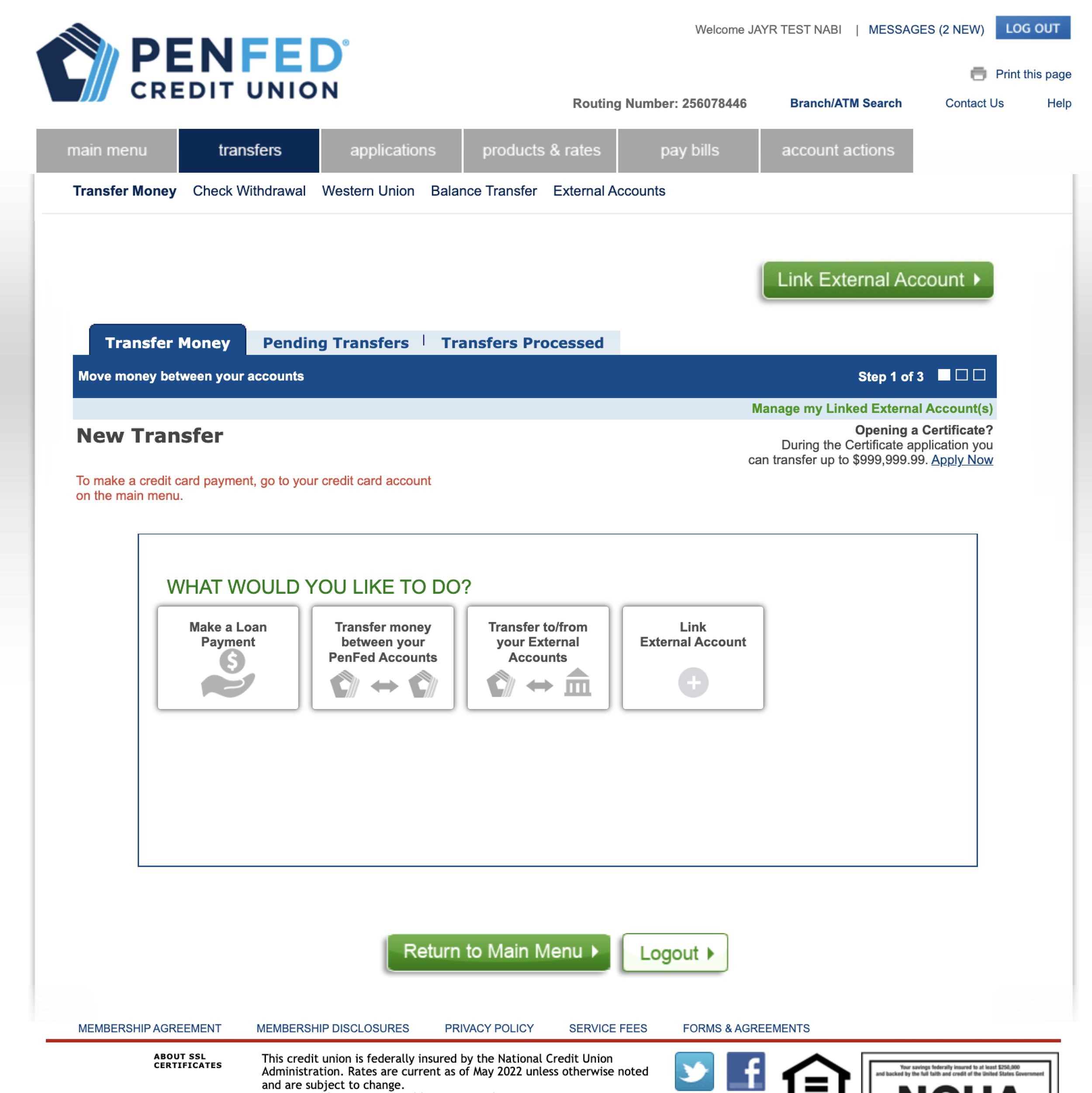
The old state of the transfer funds experience at PenFed was buried under the old navigation system. During the first stage of the PenFed Online redesign, the transfer funds functionality became more findable for PenFed members. As one of the more popular actions on the online banking platform, I needed to recreate a transfer funds flow that matched the new redesign and delivered an improved member experience.
Problem
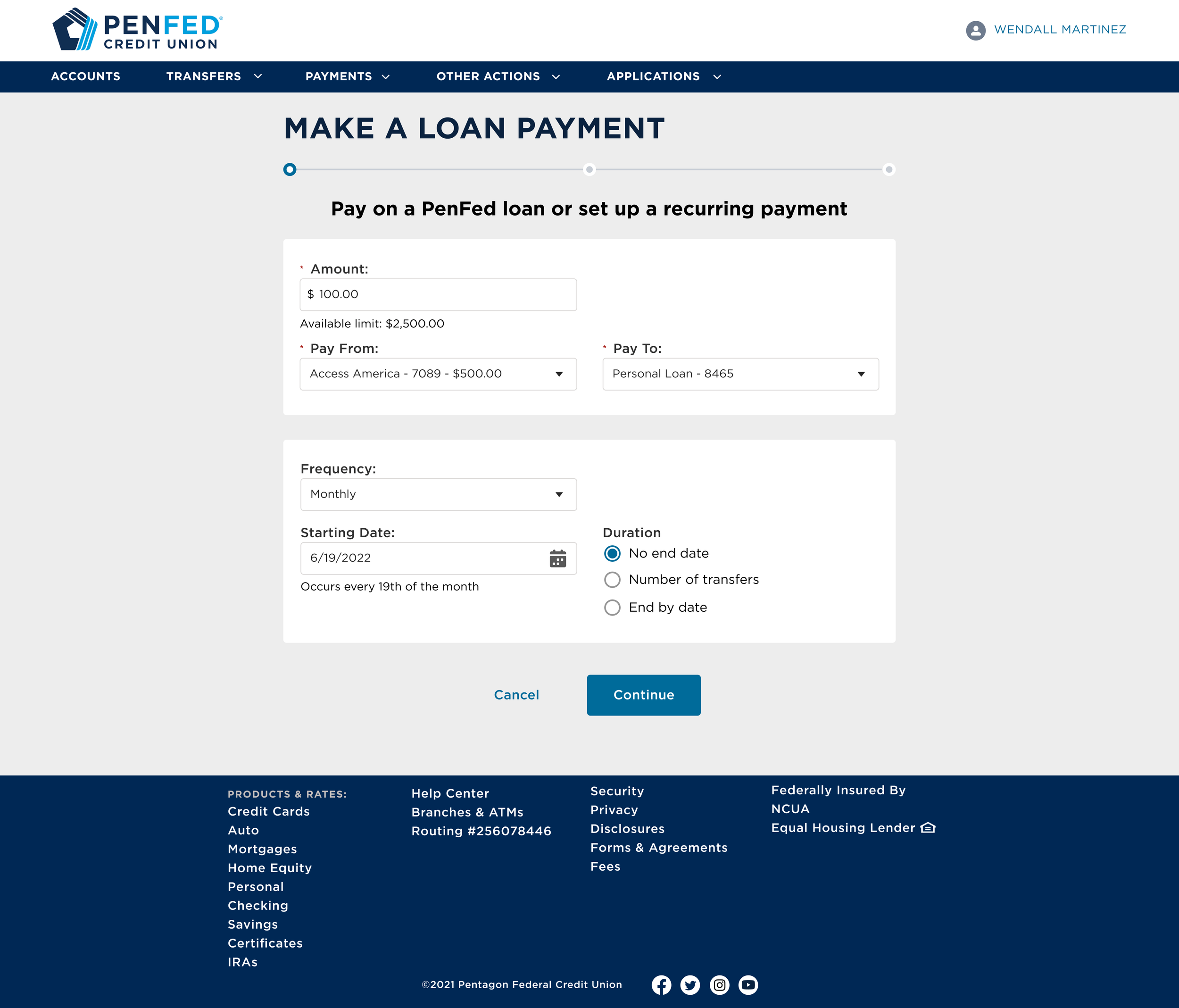
The biggest issue with the current state transfer experience was that loan payments were integrated into that experience. This became a more significant issue because the navigation structure separated loan payments from transfers. This project then became more about the structure of money movement.
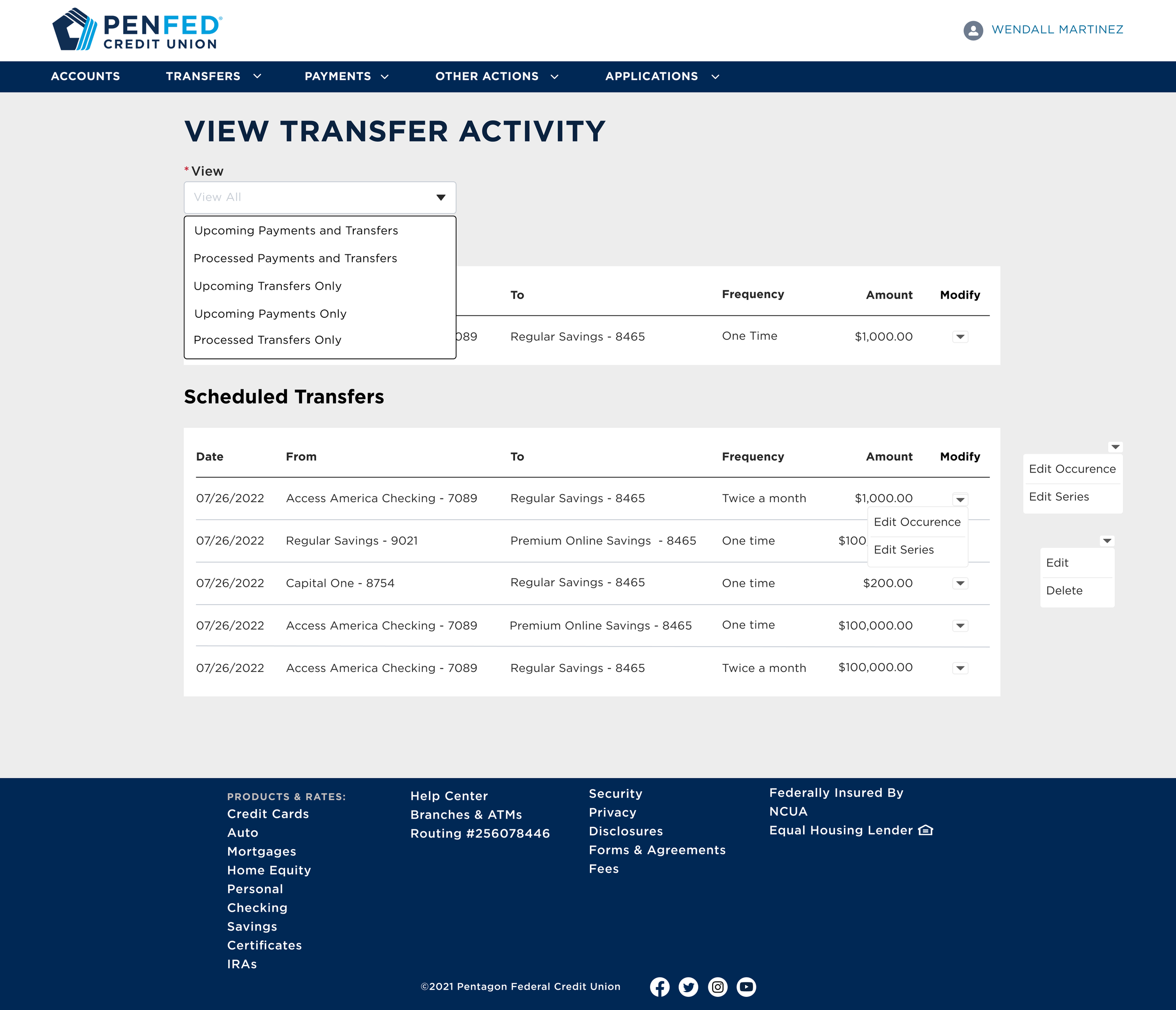
Other issues included not being web-responsive, the content being outdated, and managing the scheduled or recurring transfers/payments allowed many errors to be made.
Goal
Separate the loan payments from transfer funds to align with the navigation.
Design transfer funds in parallel to loan payment for a constant experience.
Design for web responsiveness so the PenFed app could iframe the experience.
Update content in partnership with the content strategist.
Create an effective way to manage scheduled or recurring transfers or payments.
Current State Review
To capture the current state, I worked within our QA environment and a production account to accurately capture the money movement flow. While in these environments, I tried to recreate scenarios or find any friction points that PenFed members would encounter. I also partnered closely with the product owner and business analyst to ensure I knew all the business requirements and scenarios within this experience.
Once all of the screens, scenarios, and business requirements were documented, I conducted interviews with multiple stakeholders who the new redesign would impact. I listened for issues on the stakeholders’ end and noted features that stakeholders wished to incorporate. Significant themes emerged from those interviews: updating the content and making the experience faster to navigate through.
Competitor Analysis
One thing I wanted to do with this redesign was to bring it up to speed with what other financial institutions are doing because that is what our new members would expect.
I studied what other banks/credit unions have built for multiple situations like making a transfer, setting up a recurring payment, editing payments that were part of a regular series, or looking at upcoming scheduled payments. I wanted to review
IA / Navigation
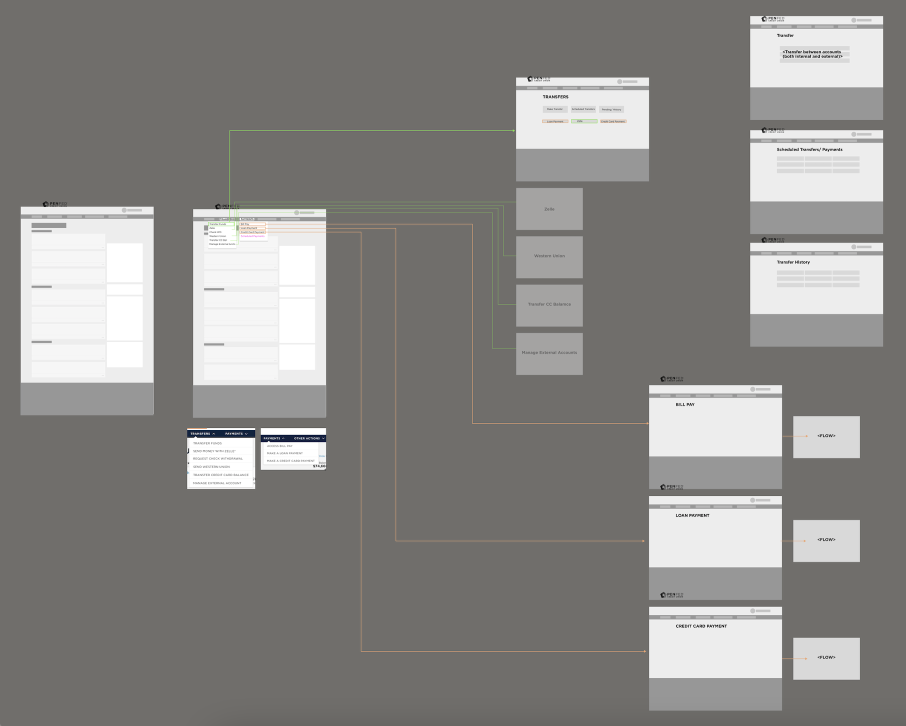
The first thing that had to be determined was how members navigated through money movement. In PenFed’s new navigation, transfers and payments became separate dropdown categories. It would seem simple to separate the experiences to match the new navigation, but this would completely change the move money flow.
I came up with two options for the structure of the experiences.
One was a landing page for transfers and payments where members could launch the money movement flow or the scheduled money management.
The second option was to establish the transfer funds and make a payment from the navigation like planned initially, then added another navigation item to manage scheduled activity.
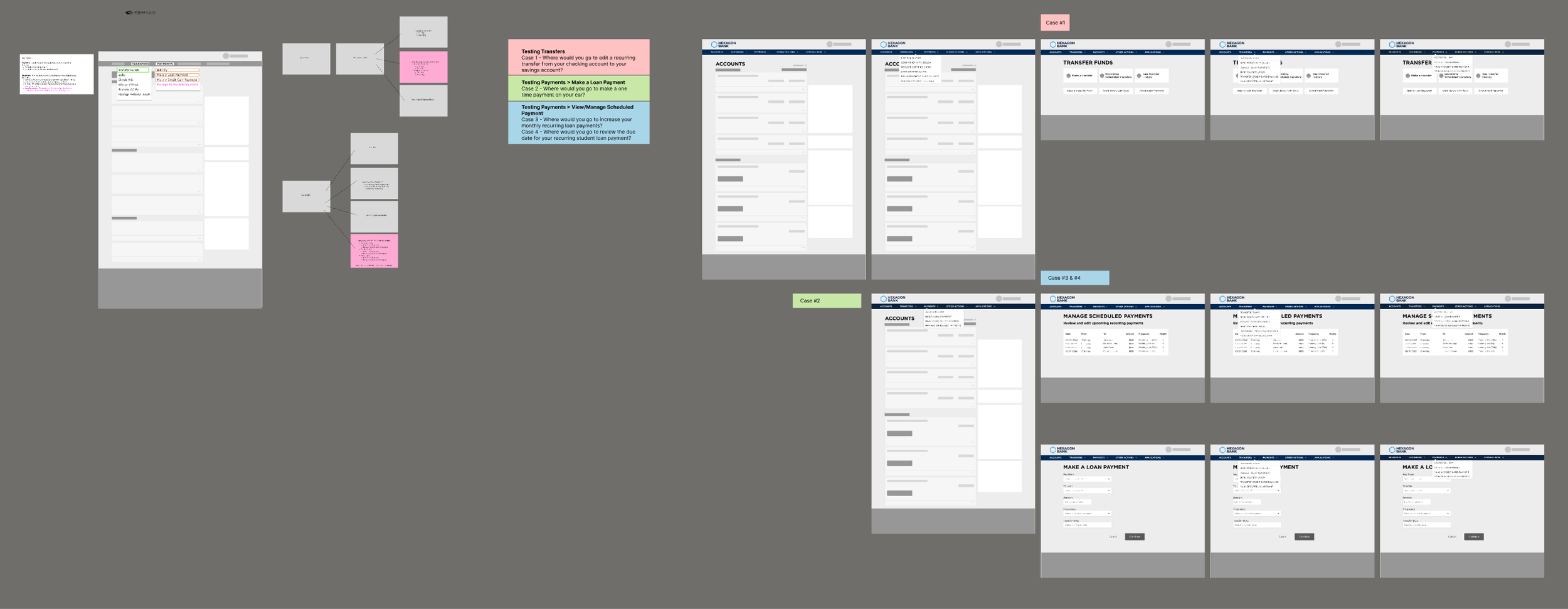
Testing the Navigation
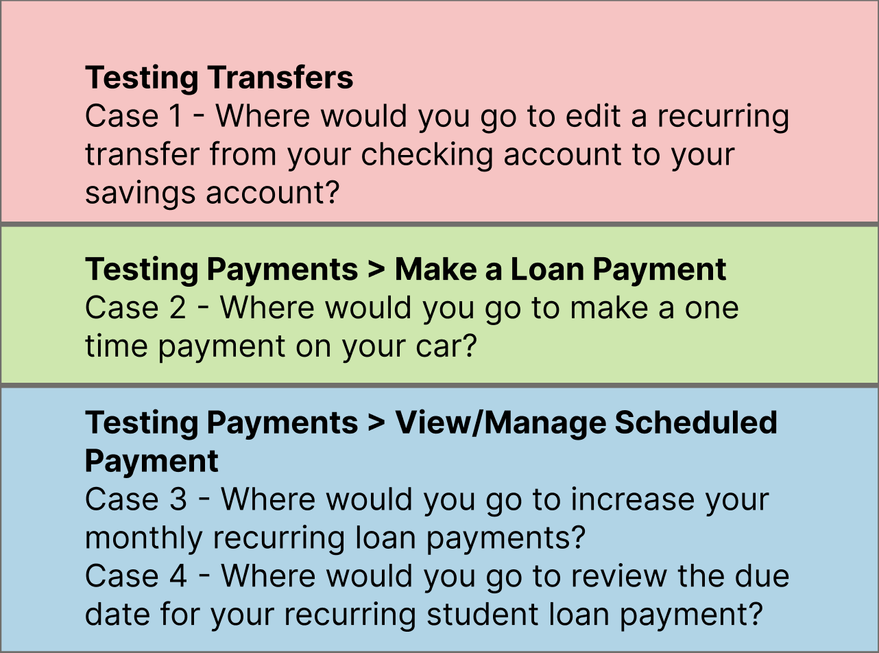
Testing these two options was integral to understanding the best direction for this experience. But first, our UX researcher and I wanted to ensure that we were defining transfer funds and making payments the way our members would since we were separating the flows.
I partnered with the UX researcher to create interview questions to help us define the two separate flows. We provided participants with scenarios and then asked them where they would go to accomplish that task within our navigation.
After determining the differences between the two flows, we tested the two IA structures for money movement. The results revealed that there was no real preference for either the landing page or different navigation launch points for managing upcoming transactions. However, we got clear feedback on which verbiage resonated with participants. Since we could not get direction from the testing, I had to determine the structure through wireframing.
Lofi Concepts
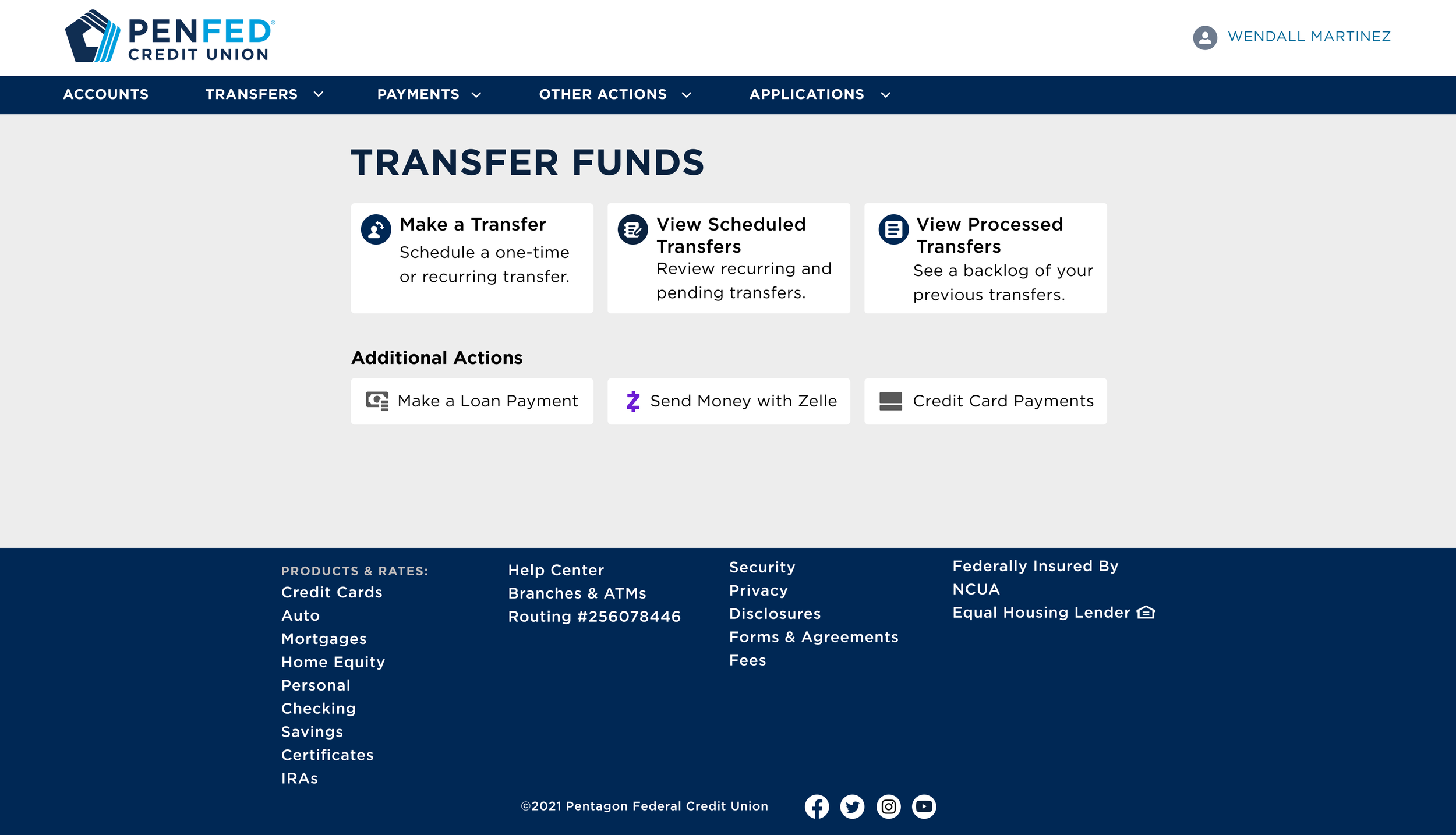
Landing Page
At first, I leaned toward having a hub-style landing page where members could launch flows from tiles on the hub page. This landing page style would eliminate the need to add another item in the navigation dropdowns.
But all the additional tiles were just fillers and did not provide value to the member. It was decided then to have separate launch points for the money movement and money management flows
Move Money
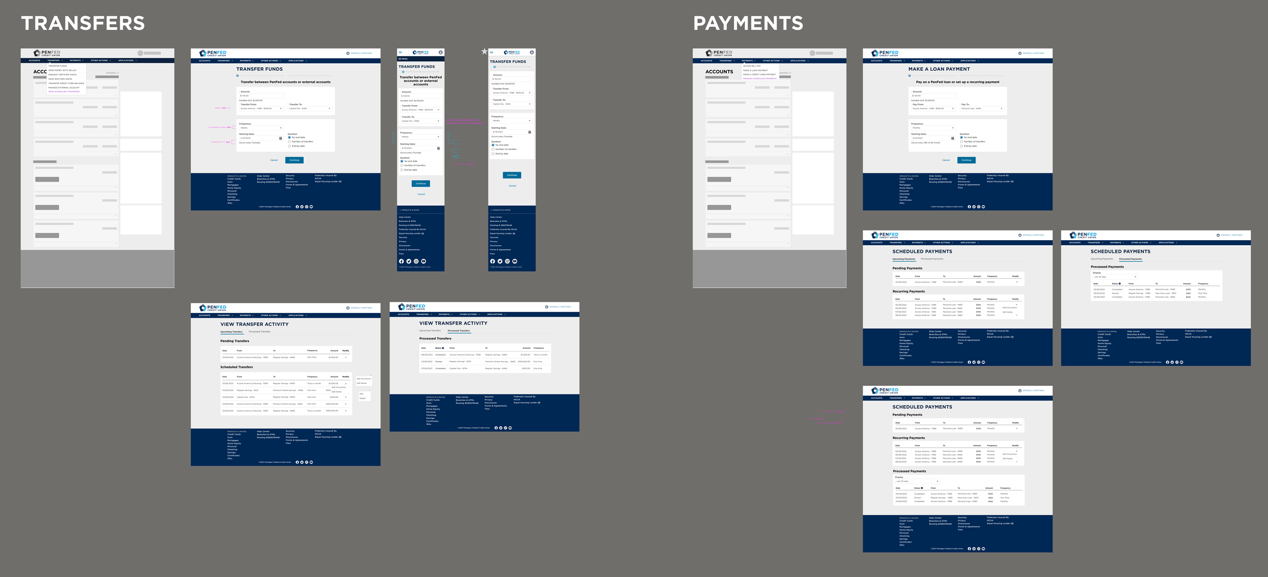
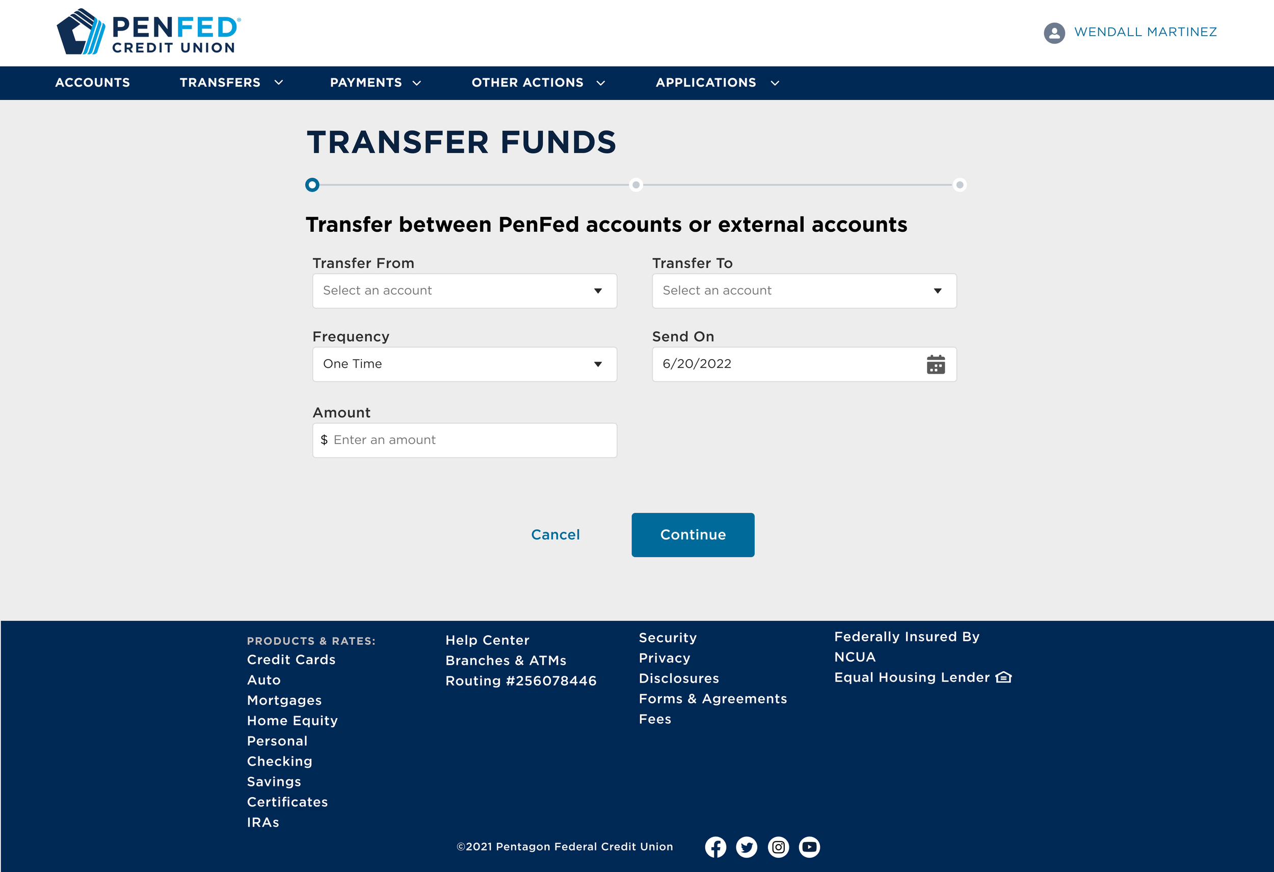
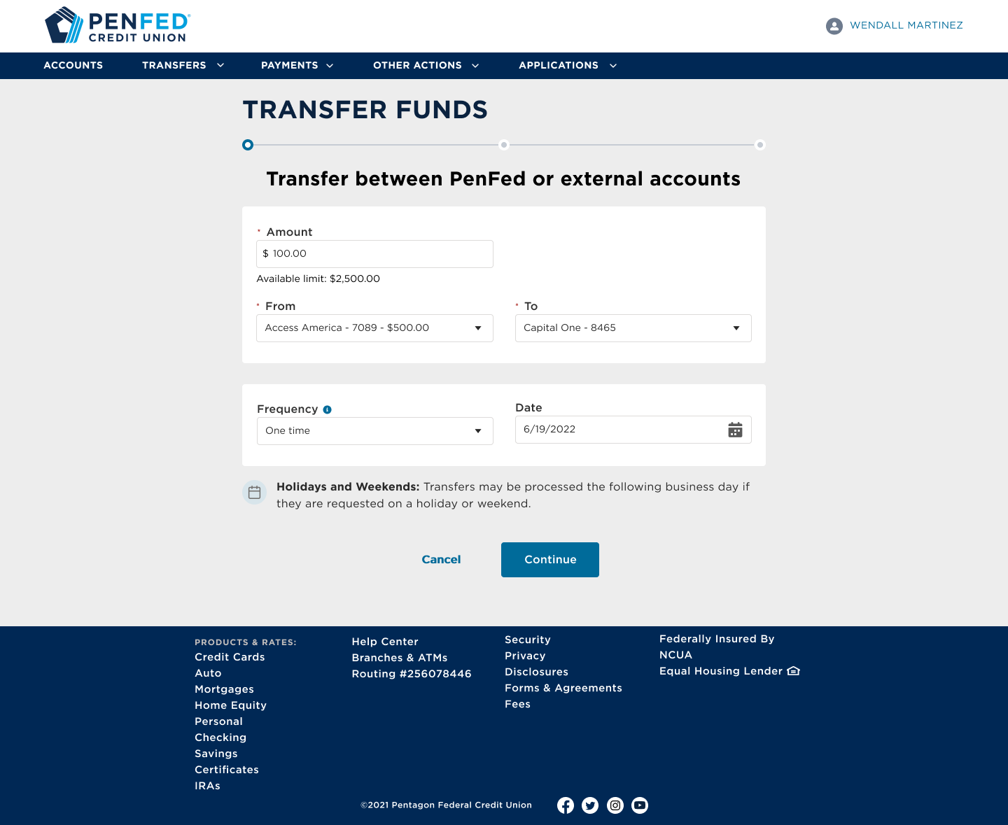
I wanted to clean up the UI of the transfer funds flow for a minimal and uncomplicated look, much like other financial institutions. The experience needed to be designed with web responsiveness in mind because the experience was going to be iFramed into the PenFed app.
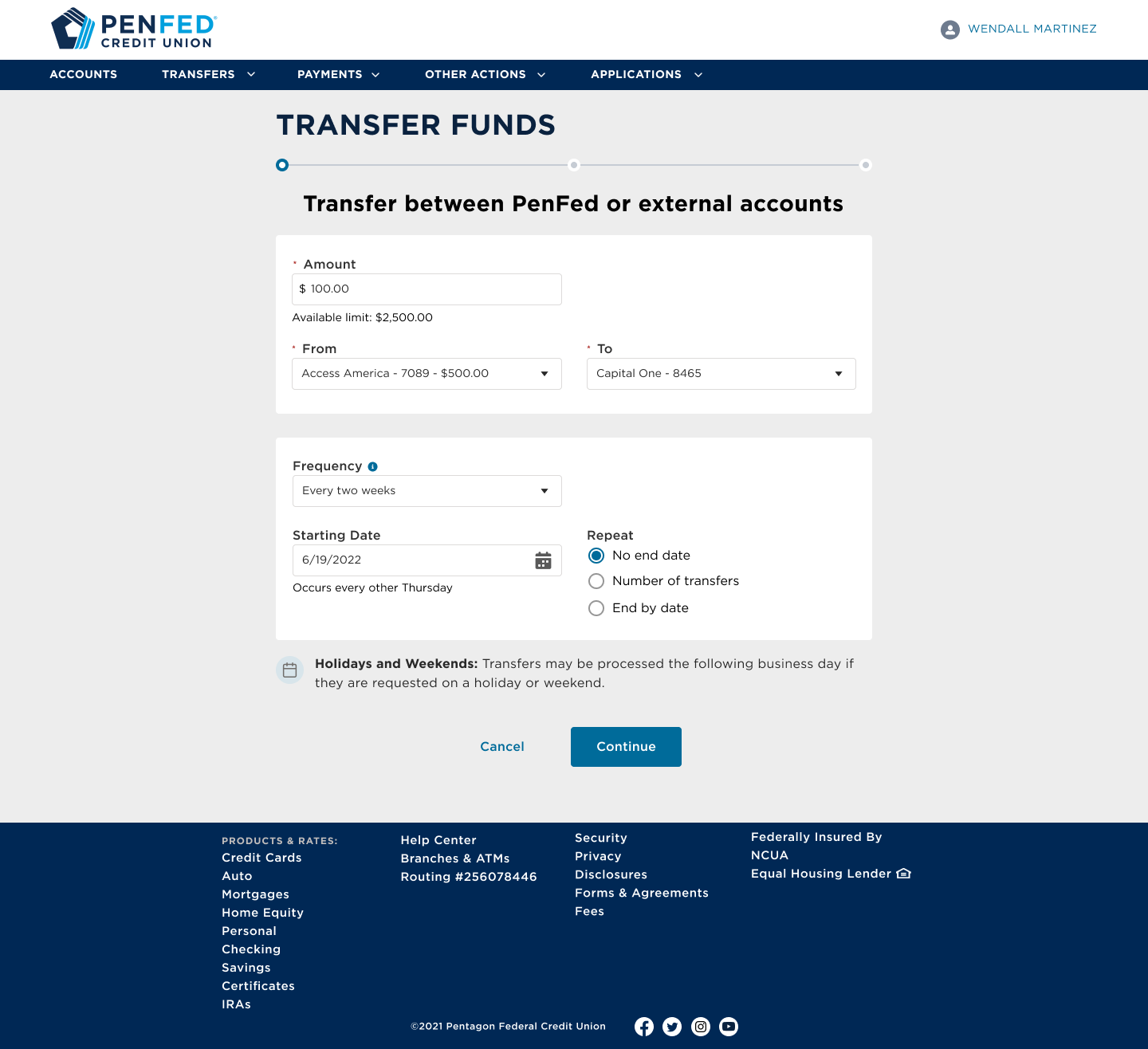
One challenge was determining the hierarchy of the interactions. The other challenge was establishing patterns for setting up recurring transfers or payments.
Using reusable components like an account dropdown with balances within the selection allowed me to clean up the page by removing information underneath the input. It would let the member know their account balance at first glance before even selecting.
For creating recurring transactions, I went through many iterations. I incorporated date pickers that would be conditional to the regular schedule and a radio set to allow the member to determine the duration of the series.
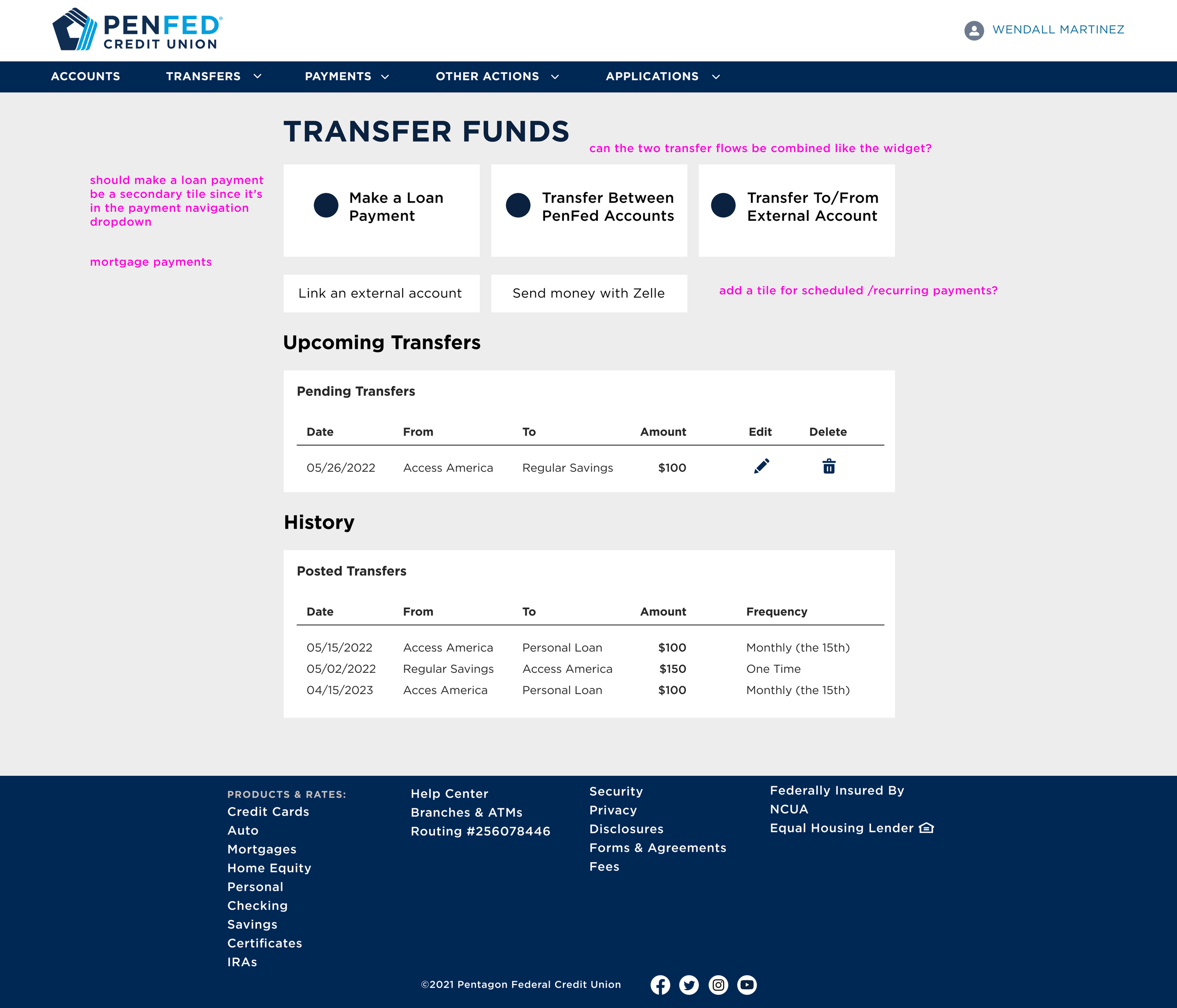
Managing Money Activity
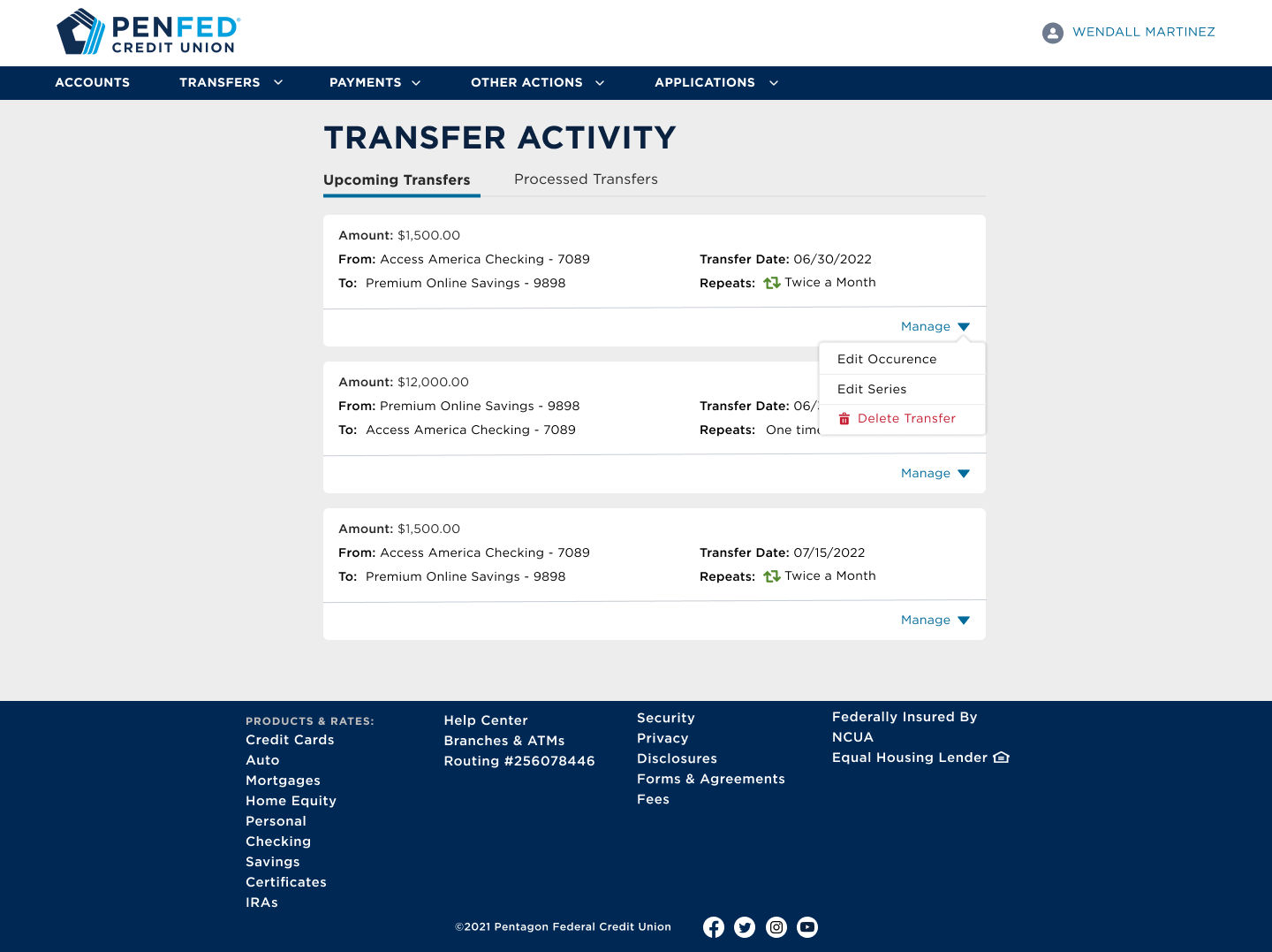
At first, I explored data tables to display upcoming transfers, but data tables would not be responsive-friendly. I wanted this page to allow the member to manage their upcoming and recurring transactions.
I decided to go with a card design so each upcoming transaction felt like action could be taken upon it versus just being displayed.
The card pattern would make it easier to manage each series of recurring transactions, and members would recognize the card pattern because I leveraged the account cards on the PenFed account summary page.
Final Design
Once all of the page layouts and functionalities were defined, I worked with our content strategist to clean up the verbiage to ensure that language was member friendly and consistent. I implemented our design standards and padding. In addition to the main screens, I designed the confirmation pages for move movement, and the edit pages for the view transfer activity/view scheduled payments flows to capture the entire experience.

