Personal Bank Account Pages
PenFed Credit Union
Role
UX/UI Designer, Delivery Lead
PenFed Credit Union’s former online banking platform used a confusing informational architecture and outdated UI. The online platform did not reflect PenFed’s brand and the services we provide to our members. These practices often led to high member support call volume because members could not find functionalities or account actions that should be easily accessible on PenFed’s online banking.
The Consumer Banking department wanted a redesign of the online platform, starting with the two account pages: Account Summary and Transaction History. Since this would be the beginning stage of an overhaul for PenFed online, the navigation also needed to be restructured within the scope of this project.
Background
Our Goal
Introduce a new intuitive navigation.
Increase findability for account information, actions, and PenFed services.
Bring PenFed into the modern online banking world with an clean and minimal UI layout.
Make the site mobile responsive.
Current State Analysis
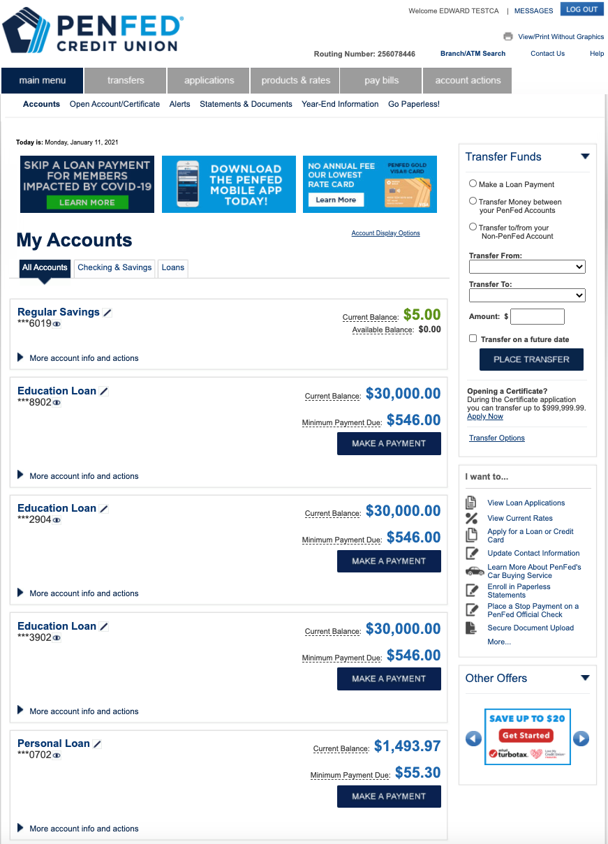
To understand the gaps and frustrations of our members, we needed to do a deep dive on how PenFed online current functions for navigation, accounts page, and transaction history
Accounts
UI design looks “clunky” and unfinished.
Multiple tab navigations within the page leaves members lost and does not let member remember patterns.
Navigation does not match page headers.
The accounts landing page is overwhelming and offers too many non-valuable options for the member to select while hiding essential actions.
Some functionalities are broken or information is outdated.
Transaction History
Transaction table is disjointed and some functionalities are separated from the table.
Pending transactions are easily missed and the table format does make sense nor follows the posted transactions logic.
Charges in red are not encouraging for members and pose an accessibility concern.
Messaging is redundant and unnecessary.
UI looks bulky and loses focus on the transaction table.
Page title “Transaction History” does not convey all the functionalities available on this page.
Navigating PenFed Online
The old navigation structure confused PenFed members, and they often had to dig around until they could find what they wanted to accomplish their financial needs. We wanted to improve the findability of account actions and services for members to decrease the need to call the member services team.
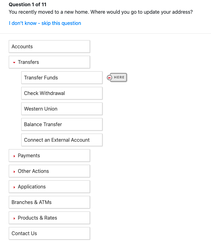
The first step to improving the findability was understanding how members categorize account actions and what necessary actions are.
We then validated our final structure with a tree test to ensure that the new navigation system was intuitive for our members.
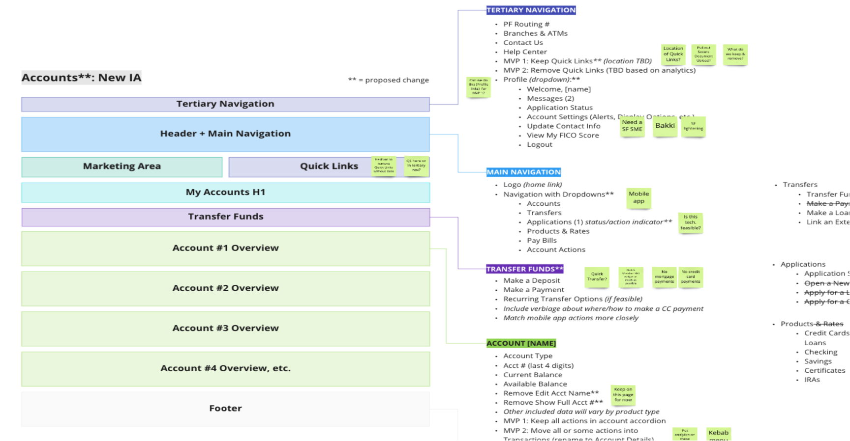
After a few iterations and several rounds of tree test validation studies, we landed with our new, intuitive site map and navigation.
Lofi Wireframing
Accounts Page
Our members had gotten comfortable with the layout of PenFed’s online banking since it has been so long from when it was last updated. Because of this, we didn’t want to “move the cheese” too much on our members, especially because a majority of PenFed members are older and may not be comfortable with a lot of change. We wanted the redesign to appeal to both new members and long-standing members.
My Accounts page was renamed to Account Summary to reflect the page's purpose and match the navigation.
The navigation bar was designed as a dropdown to allow members to see their account actions easily.
PenFed alerts were moved up under the navigation to prevent distraction from the Account Summary page while still keeping attention.
We cleaned up the account cards by creating a minimal UI to focus on balances and essential payment information.
The right rail was paired down and simplified to provide members with the most valuable quick links.
Account Summary page was made to be scalable for different responsive views, like mobile and tablet.
Account Details
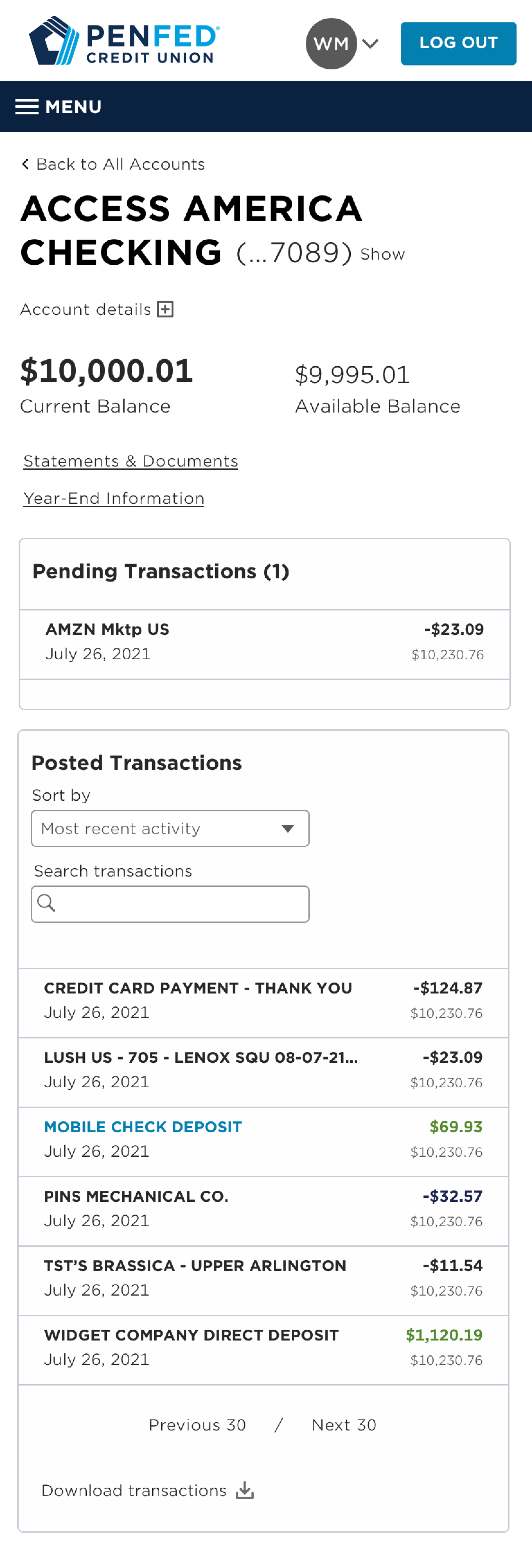
As we started to work through the current state analysis navigation, we realized that the Transaction History page was more than just that, it was a page where members could find in depth details about individual accounts. It was very clear that this page needed a rebranding. To accurately communicate to members the page’s purpose, Transaction History became Account Details.
The account details page was where I took the lead on this project. The old account details page was busy and overwhelming for members. Taking the same approach as the account summary page, I kept this page minimal and sleek without moving too much on the member.
An account information popover was placed underneath the H1 to allow the member to view pertinent account details, such as account number, beneficiaries, last statement balance, etc.
Links to statements and account documents were made easily accessible to increase findability.
Separating the pending transactions will let the members efficiently manage their financials by reviewing the balance of pending charges in the right-hand corner.
A significant improvement was giving the ability members to search and sort their transactions.
User Testing
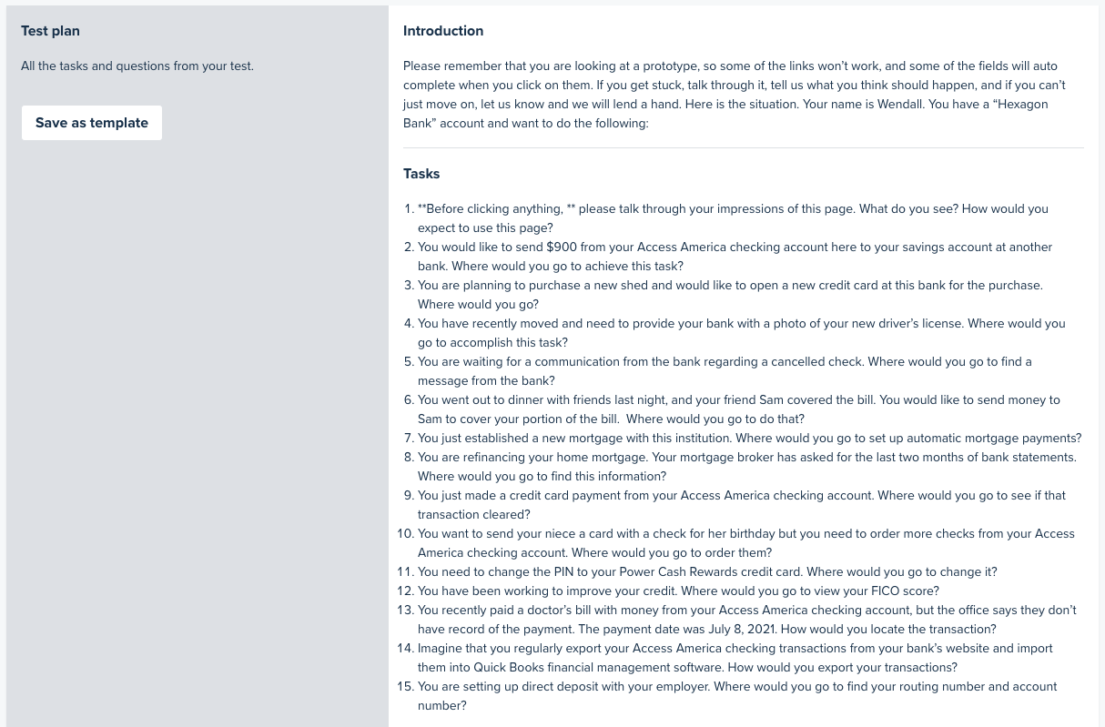
Testing actual PenFed members was critical to our usability testing, so we built our testing plan around identifying a range of participants that were also members.
We tested five members for our desktop mid-fi prototype and five members for our mobile responsive mid-fi prototype.
Each session was thorough and lasted between 45 minutes to an hour to ensure we captured the feedback from the new design and functionality.
Overall, the user testing passed successfully and only required minor changes to the two pages with low to medium usability severity.
Final Design
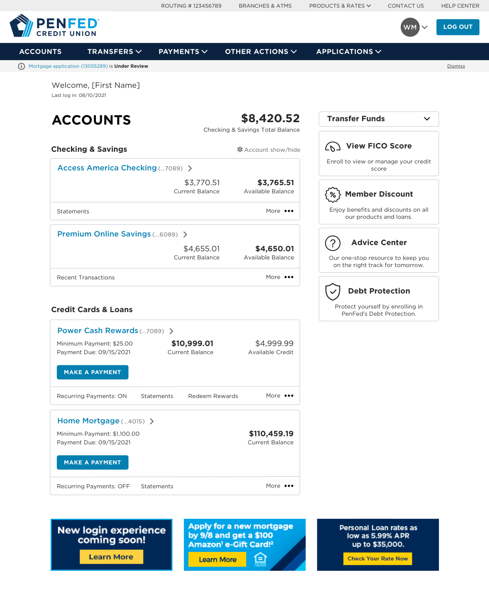
After correcting the issues identified in the user testing, we finalized the designs for Account Summary and Account Details and prepared them for final stakeholder reviews and development handoffs.
We implemented our brand secondary colors in the icons to brighten up and bring more personality to the page.
The more menu with account quick links also received a darker color treatment to define the account cards and create depth
Explore all products was added to the right to give members a way to quickly apply for other products offered
Personalized marketing offered was moved into a carousal in the right rail so the account summary page wouldn’t feel like it had too many advertisements.
Account Summary
Account Details
I reused the account card from the account summary page to display the balances and to keep the quick links under the more menu so members expect that behavior already.
Light blue highlight rows were added to indicate a deposit so transactions were visually easier to manage without using harsh colors and also keeps the table accessible.
View statements tile were added to the right rail to call attention to this link without taking focus away from the purpose of the page.
Delivery
Once the design was ready, I became the delivery lead for both pages. I worked with two development teams for each page and was heavily involved with sprint planning, stand-ups, development sessions, and demos. I partnered with the online banking’s business analyst and product owners to review account statuses and error states for the page to ensure we had designs for every possible scenario.
Collaboration between the design and dev teams was imperative for building the new pages. I represented the design team in discussions when design components were not possible and helped find solutions to deliver the pages without impacting the member experience.

